Welcome back to the Product Spotlight series in the Beanstack Blog! Here, you’ll find news about our latest features and insights into how Beanstack’s tools can help you achieve your reading goals. Whether you’re already using Beanstack, or you’re looking to build a culture of reading in your community—this series is for you.
What’s New?
A Bright New Look
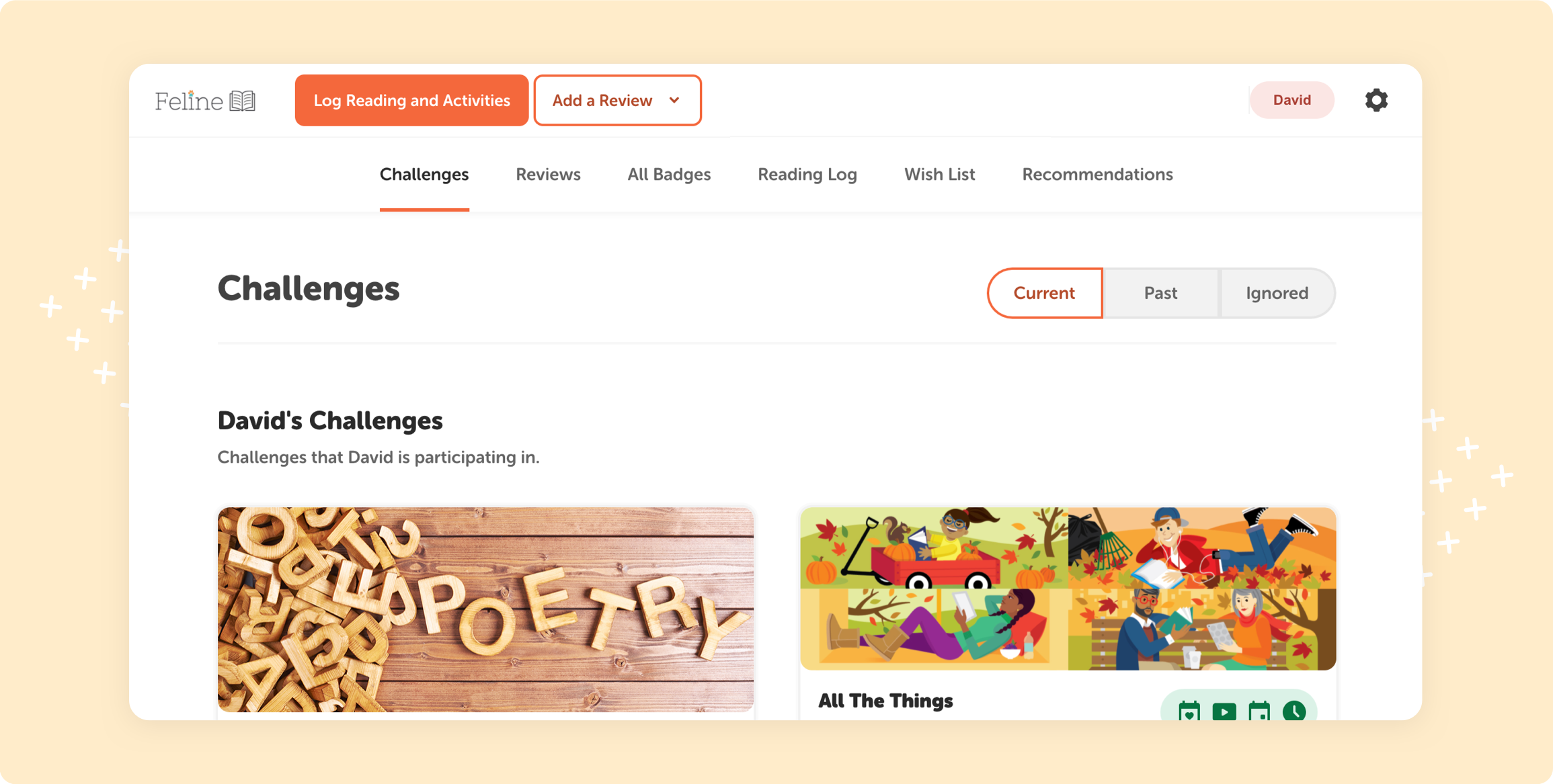
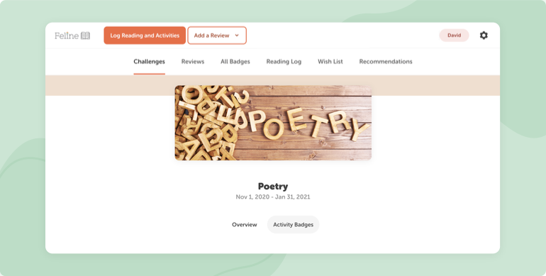
This week, readers will notice some big changes to the Beanstack web app. We’ve made major updates to the look and feel of the site, and we can’t wait for our school and library communities to see Beanstack’s bold new look.
To dig into the details behind these changes, we spoke with our Senior Designer Mike Kuzin about these updates. Read on to learn more!

Q: What was the goal for these design changes?
A: We’ve been focused on a lot of new feature development, and it was time to revisit the visual element of the web app, so that we have a more consistent approach to the Beanstack look across our products. Plus, we wanted to lay a solid foundation for the future. There are many visual and functional updates we’d like to make to the web app and mobile app over time, and this current round of changes lays the foundation for all kinds of future innovation.

Q: What can Beanstack users expect when they see these updates?
A: The vast majority of functionality will not change with these updates. Users will have the same logging experience that they already know. What they can expect is an experience that feels much more modern and visually appealing. We’ve been enhancing our brand for some time now in products like Beanbright and our mobile app, and these updates begin to bring the fun and bright look we’ve developed and used elsewhere to the web app.
Q: What’s the biggest change with these updates?
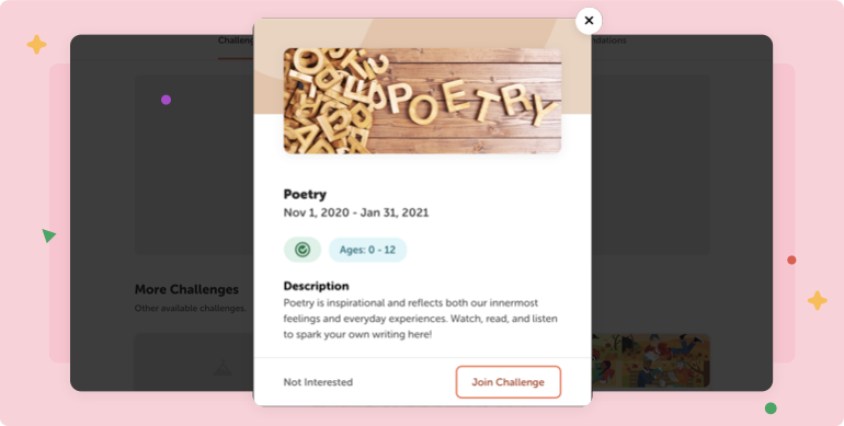
A: Definitely the challenge dashboard. We wanted a better way for users to experience challenges, so we introduced challenge cards with graphics that users see right away when they’re in the app. There’s also some filtering functionality there, so that users will see challenges they’re enrolled in and current challenges for which they can sign up, while also viewing challenges they’ve completed or opted out of in the past.

Q: What was the hardest part of designing these updates?
A: Not making any functional changes! It can be tempting with major visual overhauls like this to try to make everything shinier and more modern at once, but we wanted to keep the project tightly scoped (so that we could actually finish it!) and make sure that existing users felt comfortable with the new look right away.
Connect with Us
We hope you love Beanstack’s new look as much as we do! If you’re an educator, librarian, or parent who wants to learn more about how Beanstack can help your school, community, or family achieve its literacy goals, we’d love to hear from you. Drop us a note at beanstack.com/contact.
